I love my new site. It started as a fun way to experiment with design. The idea was to throw all preconceptions out the window and see what I can come up with from scratch. I picked the most simple idea I could and let it roll.
This article is going to talk about what makes this site so cool.
Intro
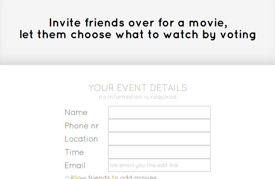
MovieAtMyPlace.com is an "invite your friends over for a movie" event creator with special features.
Features
Simple interface
There are only 3 steps to hosting your movie event
- Give details
- Specify movies
- Share link
And when your friends visit the link they've got 3 simple actions available:
- Vote for movies they like
- Add the movies they want to see (the host can allow this)
- Share the link for other friends
No event details are required
This means if you don't provide any information, the event is still functional. Here is how the invitee sees the event with full details and no details provided.

Email is instant
As soon as you enter your email you get the link to this event so you don't lose any work upon accidental tab closure for example.
Invitees can vote for movies
This is where my idea started in the first place. Sometimes there are a few specific movies I want to see, but which movie will attract the most friends to come over?
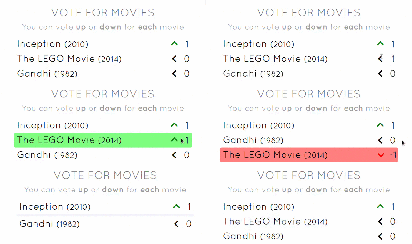
Note: Animations can be improved, a lot.
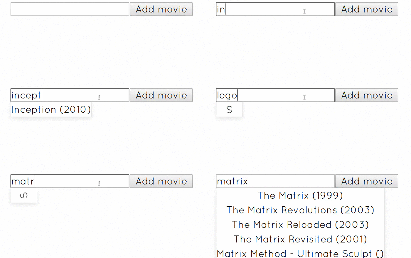
Autocomplete
The correct title is fetched from Rotten Tomatoes.
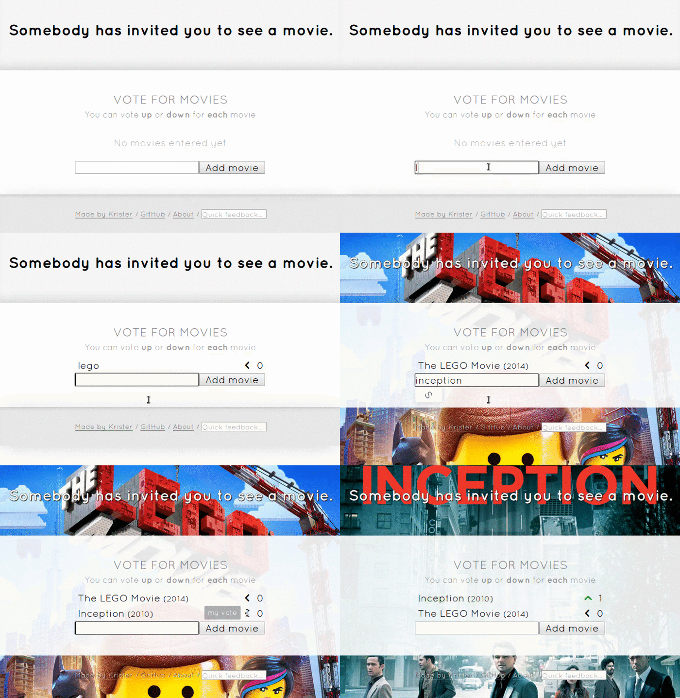
The background
At first the site looks bland. It's supposed to. It makes inserting movies even more satisfying. The background changes according to the top voted movie.
Trailers
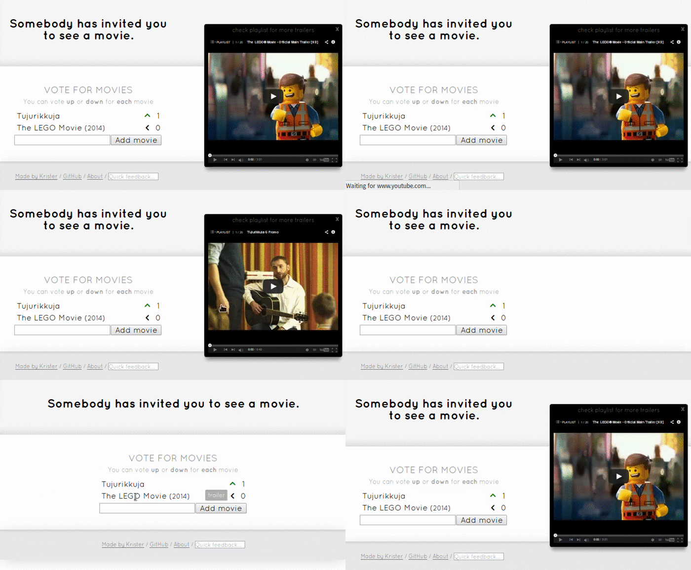
Obviously trailers should be easy to view. Well, just click on the movies title. Since it searches youtube by title and year, it also finds foreign movie trailers.
Mobile
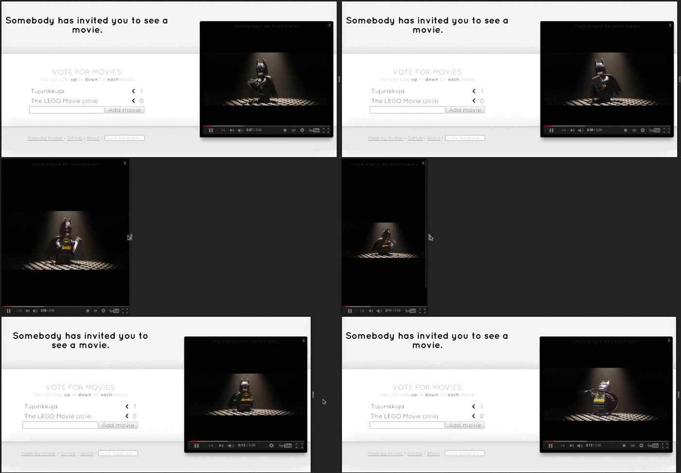
Any self respecting website today fits in any screen size.
Quick feedback
Sometimes users are annoyed and want to shout at you, you better be there to hear it!

Extra prettiness
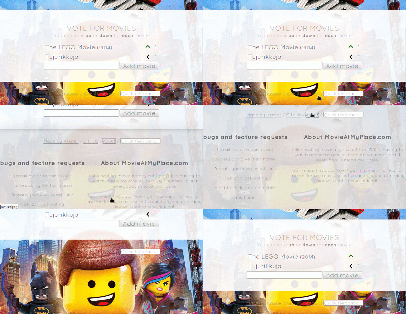
The about page reveals itself nice and smooth (this gif doesn't serve the animation right, you've got to try it yourself).
Conclusion
Having worked on this for two months I'm pretty satisfied with the result. Why two months? The design had many rewrites as users gave feedback. There's still stuff to improve, but I've moved on to other projects for now.
I'm still curious to hear what you think of it though, so drop me a line down below!