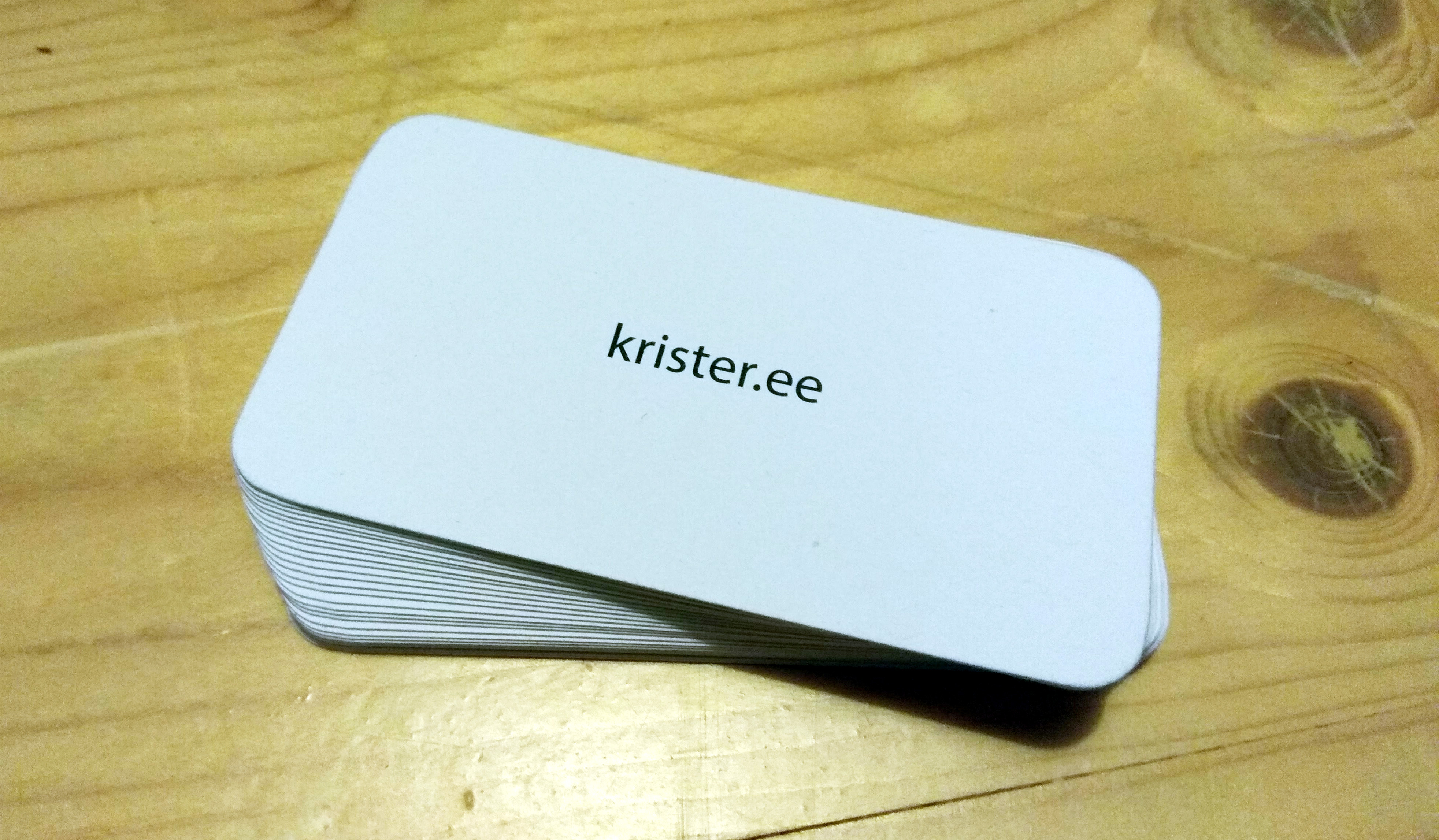
So here's my reasoning for the design.
- Sharp corners are actually painful to reach for in the pocket.
- The corners are too round, but all I had to do was say "100 cards with rounded corners with my domain on it please" so time from idea to ordering was 5 minutes.
- I have no single occupation so instead of confusing clutter there are directions on where to find my profile/contact/cv.
- It's thick and writeable so my contact knows why they need to find me. I.e. "Blockchain dev" or "Education innovation".
- The paper is recycled so I don't feel guilty.
- My domain is in the center so it's clear what the most important info is.
- I can change "krister.ee" to "event-name@krister.ee" or "service-name@krister.ee" to track where this contact is from. Email addresses that start getting spam can be blocked easily. I used mailbox.org for this as they are cheap and have encryption.
I'm a perfectionist. This card isn't perfect. This is process perfection. All this in just 5 minutes and 10€.
Are you as proud of your card as me? Link me to your blog. Find me on http://krister.ee.